Lecture Pod 7
UI is not how the website looks, but rather about presenting the user with the right tools too achieve their goals. User interfaces are more than buttons, menus and forms. It’s a connection between user and experience.
Good UI is a balance between good design and effortless usability.
Great UX (user experience) is the look, feel and usability of a website and the user interface or UI is the interactivity within the site that generates this experience.
Design patterns are standard reference points for experienced user design. It is the common navigational tools, layouts, type and overall design that is known to generate positive feedback.
Common navigational patterns include hamburger menus, navigation tabs, article lists, drop down menus, and hierarchies.
Lecture Pod 6
User scenarios are the stories that a user acts out. It is an exercise that is presented visually to put a persona into a real life situation, and demonstrates how a particular demographic may respond to the product. It allows you to understand what future users will do, use and dislike when using a website.
They should at least outline the WHO, WHAT WHEN, WHERE AND HOW
Scenarios are not predictions or forecasts, but attempts to reflect on or portray the way in which a system is used in the context of daily activity. Once the functions are identified as feasible, the developer can then move onto details in the product.
Interactive Design Persona Planning
– The Interactive Design Process: User/Artefact Persona and Scenario Planning. (2013). AceDesigns. Retrieved 27 March 2017, from https://acedesigner.wordpress.com/2013/03/19/the-interactive-design-process-user-persona-artefact-persona-and-scenario-planning/
Lecture Pod 5
Introduction to user persona and artefact persona.
User personas are fictional users, representative to real users. They represent the goals and behaviours of a hypothesised group of users. One persona should be the primary concept for the design.
User personas information include:
- age
- sex
- occupation
- hobbie
- likes/dislikes
- goals, skills, attitudes, behaviour
it is specific, and gives shape to your user base. Focusing on your core audience still allows you to cover your larger audience.
When defining personas, you must ask
WHAT is the task your user is trying to perform.
Are there different tasks for different personas?
HOW
Are users looking for one item? Are they looking for something specific.
Discovery vs specific path may be task dependent or user dependant.Most sites allow to browse or search to accommodate for both paths.
Mental models can illustrate how a user approaches a particular problem, this is why we create personas.
Artefact personas are most useful for client meetings. The artefact is the project or product and what it communicates. In order to develop an artefact persona, you need to ask these questions
- if the interface were a person, what would they be like?
- How would you expect users to react when they first view the product
- How would you describe this product to a friend?
- How is this product different to competitors?
- Which celebrity, car, or movie etc is the product most like? Least like? Why?
Persona – Dave Smith
Lecture Pod 4
Instructional design relates to assessment 3.
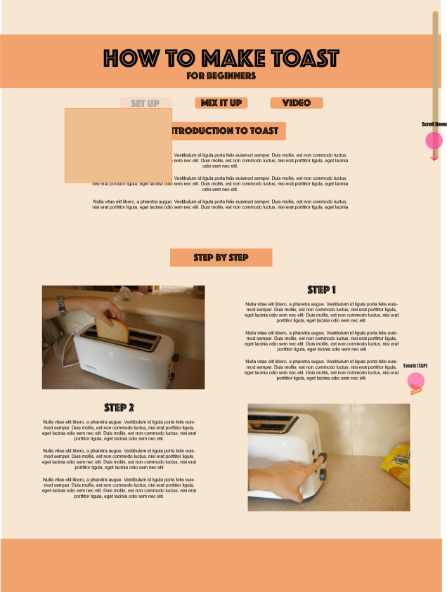
Daily life interact with instructions all the time, from an automated phone system, a parking system or operating domestic appliances such as a heater. If we were to use poorly designed instructions then these would be difficult.
Ikeas for example have picture/illustrated instructions so simplistic there is no need for text – as it is a global market. It is important to be aware of cultural differences when designing instructions. i.e reading right to left instead of left to right.
Working memory refers to how we manipulate memory in our short term. Research into the cognitive load theory allows instructional designers to learn how the brain manipulates information.
If a persons attention span is split over visual and verbal information, it can overload the working memory and cause problems or confusion. Layouts do not have to be symmetrical, if the rigid format will be easier for the user to process and understand the information received.
It is also noted that things that are close together are closely related in an instructional diagram.
Photography in instructional design is not recommended over illustrations. The material contains too much information to be useful. Every detail has equal isual weight.
Kinds of interaction by Alberto Cairo
- Instruction (clicking buttons)
- Conversation (back and forth dialog) eg NY Times ask for individual factors to decide if its better to buy or rent for you personally
- Manipulation (Drag and drop elements)
- Exploration (playful, game like)
Lecture Pod 3
The pod begins outlining its intention to discuss screen design basic an design patterns for screen. ‘By patterns, we mean conventioned developed in terms of user interface’ Waterson begins. Patterns can differentiate between mobile, tablet, laptop and desktop.
There is a movement beginning to suggest ‘mobile first’ – meaning designing for mobile first is a good approach. Starting with a small screen is more effective to adapt to a larger than vice versa. Mobile first design forces us to prioritise, choose and alter our mental structure.
Christopher Alexander, author of A Pattern Language, discusses design patterns in interactive design. Going beyond style and more than just visual repetition. The book describes methods for constructing practical, safe and attractive designs at every scale.
Some patterns to be familiar with include:
The Hamburger Menu
3 parallel horizontal lines that are widely used and remain well recognised by the community. It is commonly used to save space and hide a menu. For example, a website with a large photo background may use a hamburger menu to keep it’s sleek design minimal.
Account Registration
This may include a form to fill out, or a button that links to a social media account in order to sign up. People are more likely to continue with a process, as long as it is a small step rather than a long list of steps presented all at once.
Long Scroll
Thanks to mobile devices, everyone is accustomed to long scroll. It works well for sites that want to lure users through story telling. The site can also be broken up in one page with the use of clear headings. An apple watch relies on scrolling.
Card Layouts
Pioneered by pinterest. It presents information in bite sized chunks, and is great for scanning. Each card represents one unified concept. Cards commonly include a title, a username, a picture and icons.
Hero Images
The fastest way to grab a users attention. The use of a large image followed by a card spaced arrangement is a very common theme used in web design.
Animation
It is used to enhance a sites storyline, making it more attractive. There are two groups of animation; large scale, used primarily as an interaction tool to paralex scroll or small scale, spinners, hover tools and loading bars.
Loading animations tend to be popular for popular, flat and portfolio design.
Navigation menus can also be animated, such as a slide.
Hover effects give a more intuitive tool for instant visual feedback – these do not work for mobile.
Background animations add visibility to a site to add moderation, creating a gentle movement to an entire image.
Material Design
The use of shadow effects, movement and depth to create designs that is more realistic. It is clean design that focuses on user experience. An example of flat design is Apple IOS
Responsive Design
With the increase of responsive design, many sites look similar. The rise of wordpress sites and the booming theme market are to blame for this. However, similarity is not bad as it will still function the same.
It tends to be minimalistic, and works with cards.
Following trends are popular techniques for good reason. However, adapt patterns to suit your page.
Evolution of Interactive Media
Toast: Web