Interactive design is a multi faceted skill that a graphic designer is expected to understand and re create. A book, a mobile phone and a conversation are three examples of interactions that occur in everyday life. These interactions can draw upon a persons wants, needs, or desires and in turn generate a multi-sensory response, i.e touch, taste, sight.
The screen grab below shows a diagram mapping four different interactions, and a users engagements (Y-Axis) comparing that to its ability to react back to the user (X-Axis).
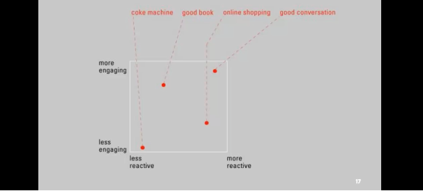
The graph shows that whilst a book may be more engaging than a vending machine, it is less reactive as it does not respond to the users engagement.
Bill Verplank
Bill defines Interaction Design to be made of 3 questions:
How do you do? How do you feel? How do you know? (1)
How do you do:
How do you do is a question relating to how do you affect the world around you? What does the user need to do to create an interaction? Verplank explains it as two choices, a handle or a button. Handles will allow continuous control, for example a car steering wheel. Whilst a button remains a discreet control tool used to activate a program or object, such as a push to start car.
How do you feel:
How do we get feedback from the world? How does a product communicate with its user?
Verplank now describes media to be in two forms; Hot and Cool.
*Mcluhan defined the difference between these hot and cool medias to be that hot media allows less involvement than cool media. For example, a lecture is made for less participation than a seminar, and a book enables less participation than a dialogue. (2)
How do you know?
Design interactions are not easy to follow without the help of a map, or path which the user can follow. As a designer, you need to decided what the user needs. Does a user need a map to see an overview of what they are to do? Or does a user just need a direction or path that allows for interpretation.
(1) Verplank, Bill. “Verplank’s sketch-lecture to CCRMA HCI Technology Course.” billverplank.com <http://www.billverplank.com/Lecture/>
(2) McLuhan, M. (1964) Understanding Media, McGraw-Hill.
